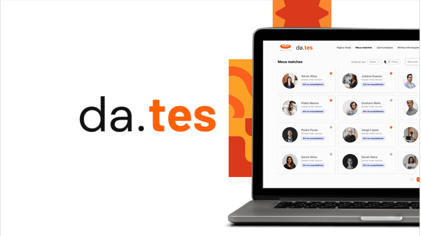
da.tes · UX/UI Design
From 824 to 2,000+ startups nationwide: redesigning the platform that became CESAR's official investment tool
- UX/UI Design
- Platform Redesign
- AI-Powered Matching
- Two-Sided Marketplace
Context & Objective
da.tes is a platform built by CESAR connecting startups with investors and corporations, using smart matching to generate personalized recommendations based on profile, business interests, and goals. I worked as UX/UI Designer within a 2-person design team, responsible for research, information architecture, and prototyping.
The objective was a responsive redesign that attracts new users organically and delivers immediate value post-registration, for two very different audiences at once: startups looking for capital, and investors looking for deal flow.
The Problem
A two-sided marketplace only works if both sides get value fast. If startups feel the platform doesn't understand their pitch, or investors feel matches are irrelevant, the whole loop breaks before it starts. Organic growth depends on immediate, visible value right after registration, not eventually. Each side arrived with a different frustration:
- Startups struggled to secure connections and present their business to investors in a way that got noticed
- Investors needed an efficient way to find relevant startups without wading through noise
Success Criteria
Fully completed profiles on both sides, a landing page that communicates the platform's value proposition clearly, and an onboarding flow simple enough that neither audience abandons it halfway through.
The previous platform was a static landing page with a single call to action, no dashboard, no data. The redesign turned it into a product experience built around progress and match quality.
Before
A single-purpose landing page with no dashboard or data
After
Two audience-specific landing pages, one for startups and one for investors and corporations
Process
The process started with 10 user interviews, five with startups and five with investors, to understand both sides of the marketplace before designing anything.
Stakeholder interviews
Run in depth ahead of the Design Sprint, they mapped needs and pain points separately for each group. This is what shaped which features got prioritized in the redesign.
Design Sprint and prototyping
Built mid-fidelity prototypes for both the startup and investor flows to test initial hypotheses.
What testing validated
- Landing page redesign: clearer communication of the platform's value proposition
- Onboarding flow: redesigned to make functionality legible from the first interaction
- UX writing adjustments: clearer instructions and tooltips across the platform
- Profile and registration fields: enhanced for both startups and investors, to improve match quality
- Opportunity listings: restructured information (challenges, investor profiles) to be more engaging
UI System
A component library shared by both journeys: one color palette, grid, type scale, icon set and logo, plus buttons, input fields, checkboxes, radio buttons and tags specified across every interaction state, and a single card component reused in the opportunity and startup galleries.
AI-powered matching
Beyond the interface redesign, the platform's core matching logic runs on a predictive model that scores startup-investor compatibility based on stage, sector, traction, and history, not just keyword overlap. Getting this right meant working closely with the technical team to translate qualitative interview insights (what actually makes a match "feel right" to both sides) into the scoring criteria the model uses.
Startup Flow
Investor Flow
Results & Impact
- From 824 startups (year one) to 2,000+ registered nationwide across Brazil
- Lean MVP validated with 103 startups and 33+ matches before scaling
- The prototype became CESAR's official investment platform, not just a design exercise that shipped and got shelved
- R$8 million in projects channeled through the platform
- Two distinct, mapped user journeys (6 steps each) for startups and investors, from landing page to closed opportunity
- A live, responsive platform, still running at dates.cesar.org.br
Why this matters
Designing for two audiences at once
Designing for a two-sided marketplace means every decision has to work twice, for two audiences with different incentives and different anxieties, without making either one feel like an afterthought. The hardest part wasn't the interface. It was holding both user journeys in mind without collapsing them into one generic flow.
Research behind the AI
Research drove the product decisions here, including the AI-driven ones. The matching model's scoring criteria came from qualitative interview insights about what makes a match feel right to both sides, not from engineering assumptions. That meant working with the technical team to turn a business need for better, more trustworthy matches into a concrete technical spec.
From business goal to product hypothesis
It also meant translating a business growth objective, organic acquisition and post-registration activation, into testable product hypotheses, then deciding which of five candidate improvements to ship first based on user testing evidence rather than opinion.
The outcome
The work didn't stay a prototype. It became CESAR's official investment tool and the client's actual operating infrastructure, with R$8M in projects running through it. That's the kind of outcome that only happens when product decisions stay tied to business impact, not just usability.